01 · the problem
Brands are usually built backward.
Brands are usually built backward. The starting point is whatever has been seen and shared often enough to feel safe: trends, virality, what worked last quarter. The motivation moves from the origin that created the product to the destination it hopes to land at, and somewhere along the way the origin gets traded for charts.
What that costs isn’t a metric. It’s trust. People often can’t say why a brand feels unconvincing, but they can tell a story from a collection of trending ideas. The absence of meaning registers whether or not it can be named.
This project tests that from the opposite direction: start with no brand, no product and no audience, and see what it takes to make something that feels like one place and not two.
02 · the idea
Keep one string running back to the question.
Every brand begins as a question someone answered. Keep one string running back to that question, and everything built afterward holds together. Lose the string, and no amount of polish brings the coherence back.
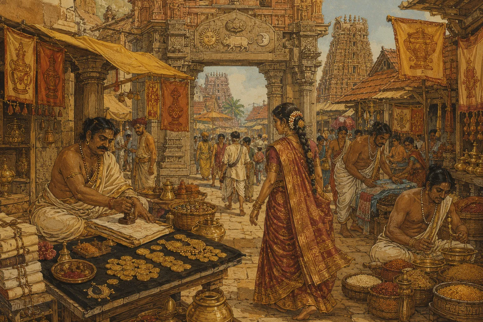
Vijayanagara is the proof. In the fifteenth century, this southern Indian city was a place where the symbols of daily life carried one theme on purpose: the gopuram worked as a billboard, the zari border on a saree as a label, the pillars engraved with donors’ names as publishing, and the city as a whole was a brand. Nothing in it looks accidental, because nothing was. Five centuries later it is still legible.
The thesis underneath: advertising is older than media. It is a civilizational instinct, and the oldest examples were built into stone.
the gopuram
↓billboard
Seen from every road into the city, saying one thing from miles away.
03 · the system: coherence
Not a mood board. A world you can walk through.
Mid-century Indian illustration
Warmth and narrative clarity: the storybook quality that makes a scene readable at a glance.
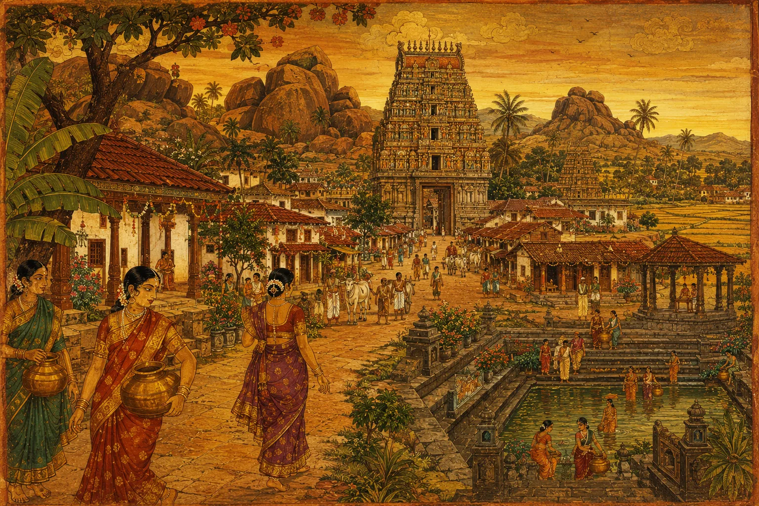
Lepakshi mural
A temple painting style from the Vijayanagara period itself: the actual visual vocabulary of the world being depicted.
The palette, sampled from the frames themselves. Nothing outside it made the cut.
Coherence isn’t a mood board or a palette. It’s a world you can walk through and still feel the same idea in every corner of it. Two decisions held this one together.
decision 01One language, locked first.
Before a single frame was generated, the visual language was fixed: mid-century Indian illustration crossed with Lepakshi mural. Each half has a job. The illustration tradition brings warmth and narrative clarity, the storybook quality that makes a scene readable at a glance. The mural tradition, a temple painting style from the Vijayanagara period itself, brings the actual visual vocabulary of the world being depicted. Together they mean the images don’t just describe Vijayanagara, they speak in a dialect that belongs to it.
The reason to lock this first is that generative tools drift by default. Left alone, every new image pulls slightly toward the tool’s own habits, and a dozen small drifts add up to a world that no longer feels like one place. So the look was treated as a set of rules to be defined up front and checked against, not a mood to be rediscovered with each generation. Every image began by answering to the language instead of inventing one. That is the same reason a brand needs its foundations settled before its campaigns begin: consistency isn’t something you can add at the end.
Could this live in the same world?
Same tank, same women, same hour. One is sharper and brighter, and it didn’t make it: too much clarity, too much saturation, and the old-world charm gone.
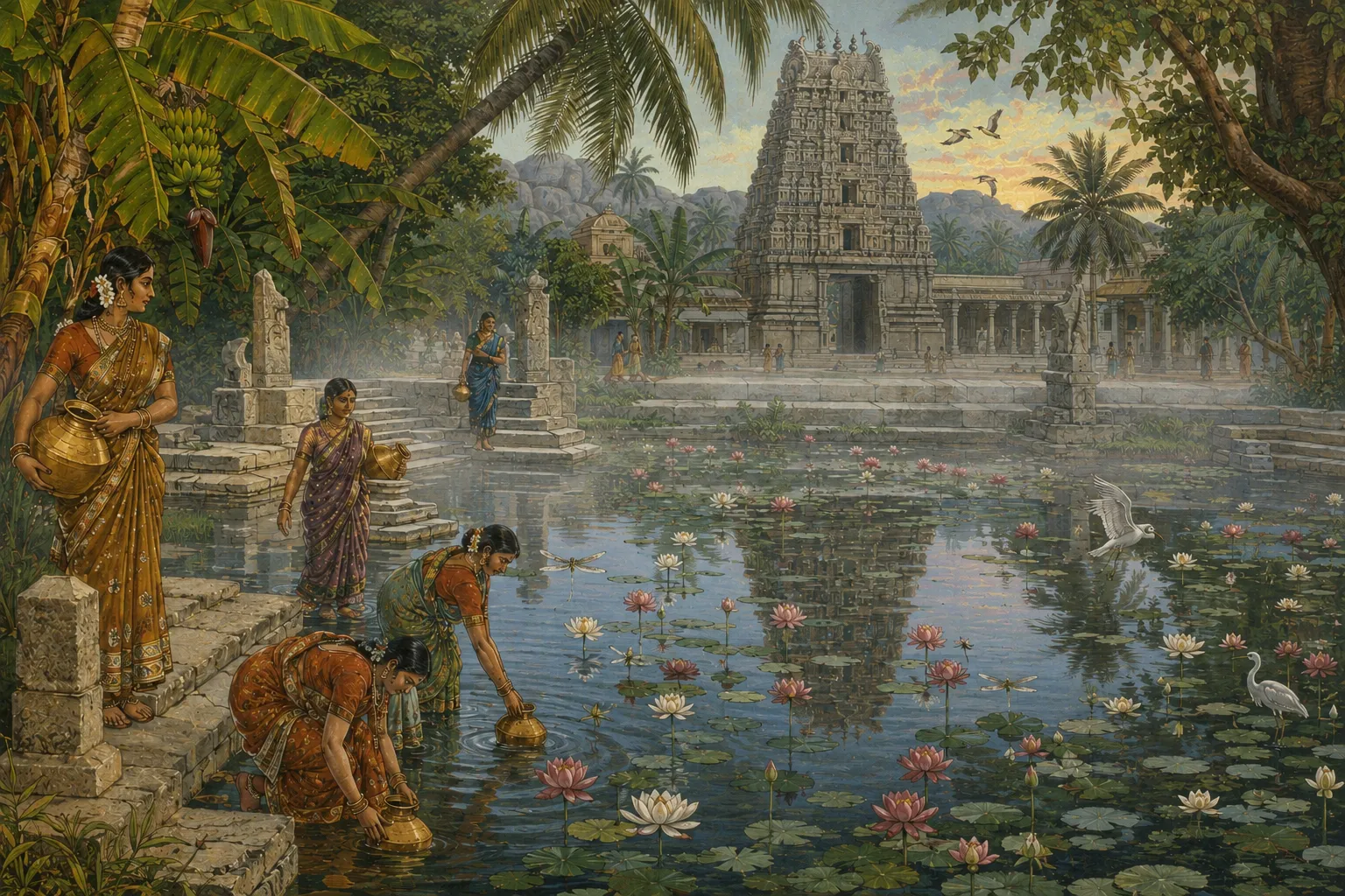
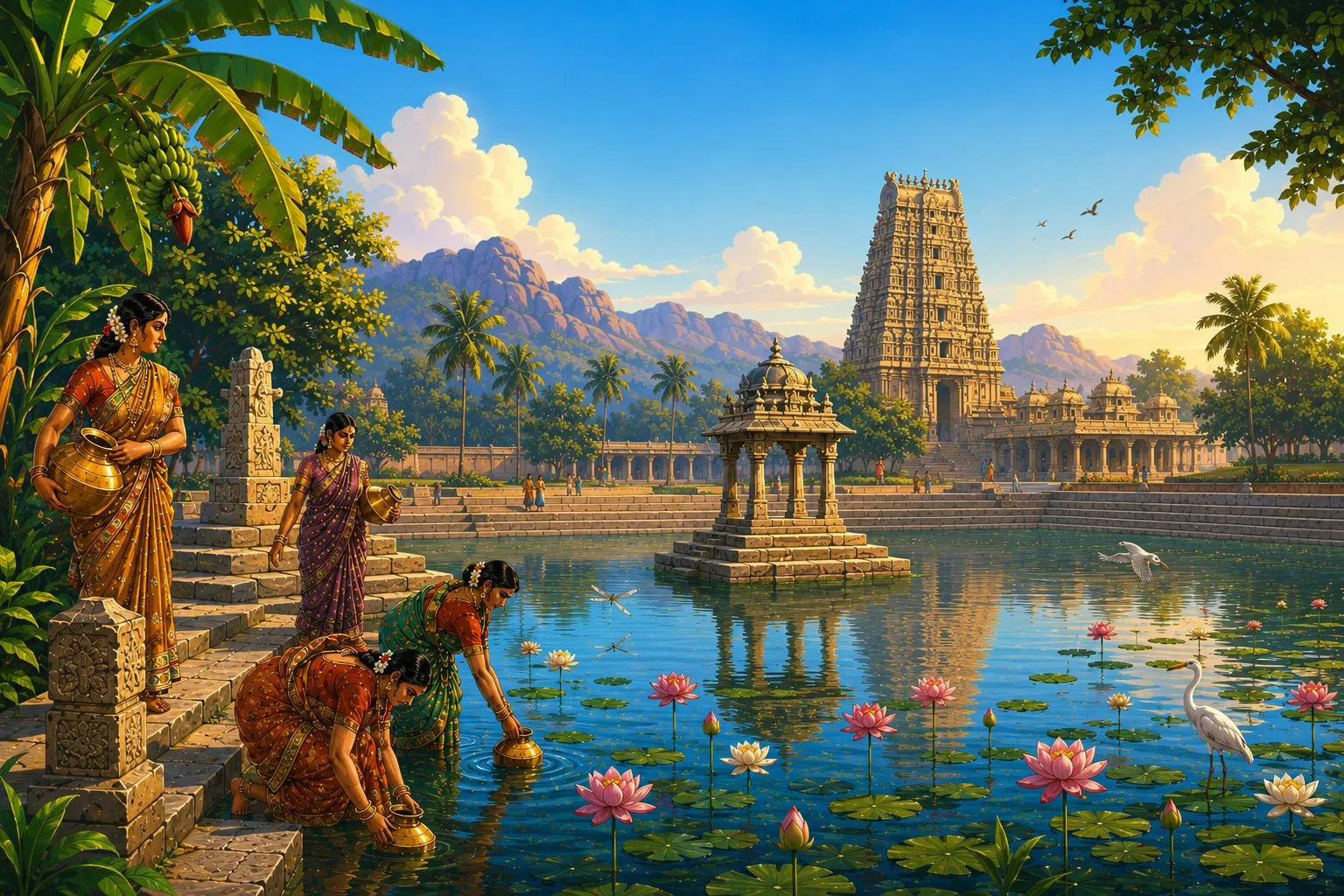 cutkept
decision 02One test.
Every asset had to pass a single question: could this live in the same world as everything else? Not “is this good?” and not “is this impressive?” but whether it belonged.
The distinction matters because the two questions give different answers more often than you’d expect. Some images looked strong on their own and still didn’t make it, because they pulled the world in a direction the string didn’t point. A beautiful asset that belongs to a different world weakens the one you’re building, because coherence is about how elements relate to each other, not how each performs alone. The elements should accentuate each other, and when one doesn’t, the viewer feels it before they can explain it.
Applying the test is subtractive, and it costs something: fewer assets, slower progress, and real reluctance in cutting work that took time to make. But it’s the only mechanism that actually protects the whole. It works the same way on a homepage, a campaign or a product launch. Anything that doesn’t answer to the core idea gets cut, however good it looks in isolation.
04 · the screening
The world, in motion.
Through the market gate. The seal on the arch is the seal on the coin.
The temple tank. Water drawn at the hour it has always been drawn.
The pillared hall, where names are cut into stone to be read for centuries.
The same street, told in the mural’s own hand.
Every road leads the eye to the gopuram.
05 · what it shows
Find the string. Then refuse to let go of it.
Starting from nothing, this project found the question a brand answers, defined the rules that protect it, and built a world that stays true to it across formats. The strategy shows up as images and motion that carry the argument instead of decorating it.
That is the work KeepNorth does for a client. Find the string: the original question the business exists to answer, often buried under years of trends and borrowed language. Define the rules that keep it intact as the brand grows, so that every campaign, every asset and every new format still points back to the same place. Then build, with the discipline to cut whatever pulls away from it.
Brands rarely fail by lacking ideas. They fail by having too many that don’t belong to each other. The gopuram never needed updating every ten years to stay a billboard, and the zari border never needed a rebrand to stay a label. They held because what they pointed to never changed.
A brand, like a civilization, is not remembered for what it made. It’s remembered for what it refused to let go of.
read the essay: brand architecture, what coherence looks like ↗